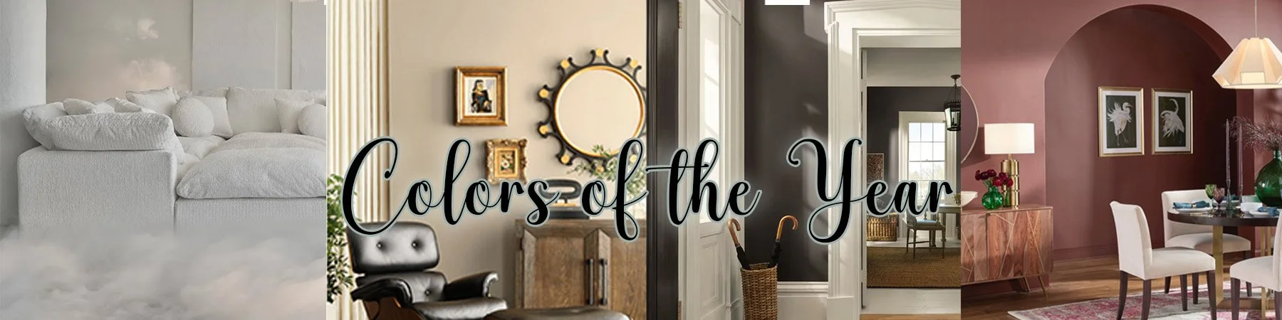
In the interior design community the “color of the year” doesn’t always mean anything to the designers. We feel that color is based on what the client loves, not a color that is a trend. With that said, we thought it would be fun to share the different colors of the year!
This years colors are all really pretty and fairly neutral. Colors that we would definitely approve of!
Pantone: Cloud Dancer
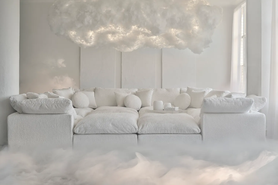
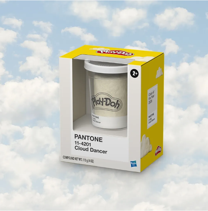
Pantone is traditionally a color based for web work, not physical coloring. This is more of a universal color of the year, but it would make a lovely trim and ceiling color!
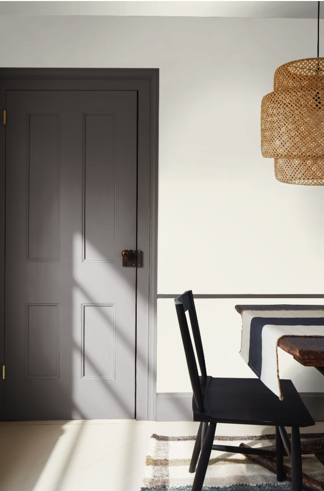
Sherwin Williams: Universal Khaki
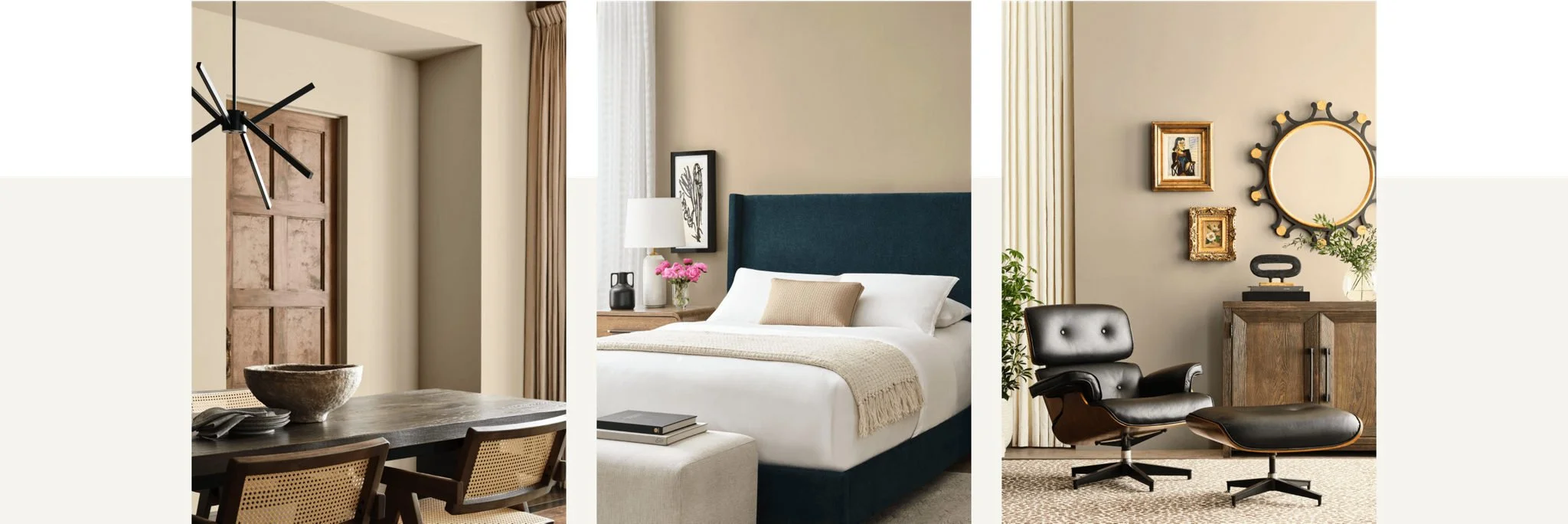
Universal Khaki is definitely a color we would use at Evelyn James. It’s a beautiful neutral color and a great alternative to white walls, but still bring bright and crisp! We have samples of this if you are interested!
Benjamin Moore: Silhouette
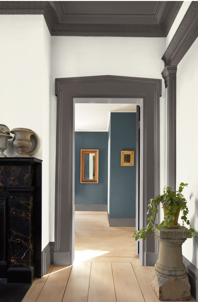
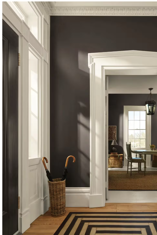
While dark, silhouette is really beautiful! It’s sort of a muted chocolate brown or a dark version of the “greige” that was popular for a long time! This would add a great pop to a space
PPG Paint: Warm Mahogany
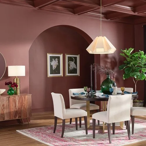
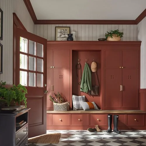
Warm mahogany is definitely the most colorful of the “colors of the year”! Although it does have a red tone, it can also be a warm neutral. It’s a color you’d see in earth tones and very similar to the arts and crafts reds. Very beautiful!
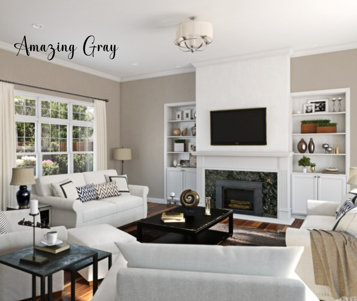
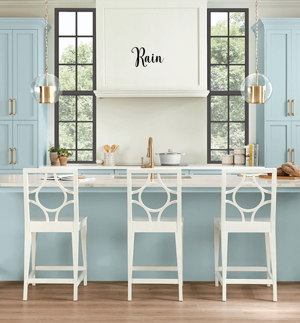
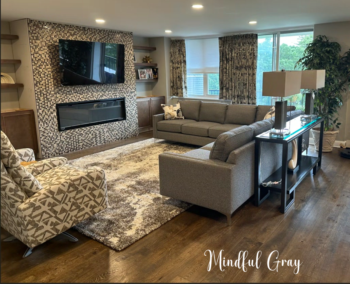
What are your favorite colors? Here’s a few of our favorites at Evelyn James!
Amazing Gray, Rain & Mindful Gray from Sherwin Williams